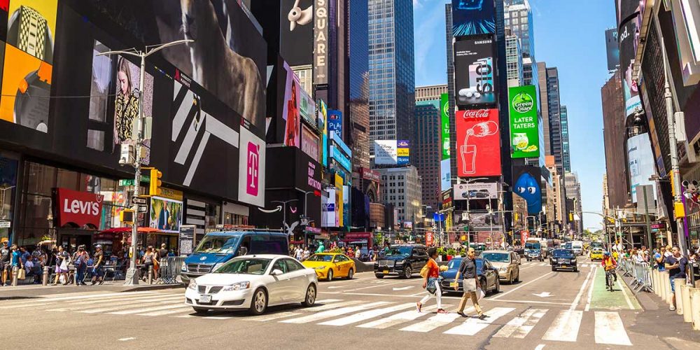
Most of us are familiar with designing print pieces up to A4 (or maybe even A3) scale, but what happens when we start to look at the bigger picture(s)?
Whilst A1 poster boards are becoming more and more popular, many designers won’t have handled many larger scale projects. Whilst a general understanding of CMYK vs RGB will get you so far, the art of designing large scale design pieces requires an element of science to provide successful results.
Here are 5 tips to help you get the most from your next sign/banner/poster project:

Images
Vectors vs Bitmap; rule number one – Use vectors wherever possible. Unlike bitmapped images (JPEG etc), vectors rely on a series of mathematical equations to determine their size, shape, lines and colour. This means that you suffer no loss of quality no matter how big, or small, you make them. Bitmap, on the other hand, comprise of individual pixels which become jagged and stretched when over scaled.
An added advantage to vectors is their file size. They are generally smaller than their bitmap counterparts, which may not be an issue to you, but will effect load times and printer spooling down the line, as well as computer performance.
By all means, still use bitmap images, but make note of the equation below as a guidance to recommended minimum DPI according to viewing distance.
You can calculate this using the following formula:
DPI = 1/((distance x 0.000291)/2)
Fonts
When designing for large scale, picking fonts should always follow the golden rule; form follows function. Assuming you are expecting a long viewing distance, readability of a font must always be taken into consideration, with many script style fonts instantly becoming a no go.
There are a number of things to consider, including but not limited to;
- Font weight; chunky fonts can become overcrowding whilst thin font weights can disappear into the background
- Font spacing; applying kerning to a font can cause gaps between letters and spaces between words to become lost, whilst condensed fonts can make it harder for viewers to distinguish individual letters
- Font colour; go for contrast, pale fonts on light backgrounds are likely to get washed out whilst dark fonts on black backgrounds will also do the same. We recommend keeping all text on plain backgrounds without background image where possible
This is a difficult one to test, but for readability, try sending the document to someone outside your process and have them view it on the monitor from several distances to see what works and doesn’t work for them. If you can find more guinea pigs even better!
If you want to get away from cross platform fonts (Arial, Georgia, Times New Roman, Trebuchet, Verdana etc.) make sure you outline your fonts. By converting your text into shapes, you remove the risk of fonts displaying incorrectly when printed.
P.S. don’t forget to save two versions of your file (one with the text as normal, and one outlined version) so you can go back and make amendments if need be.

Colour
As mentioned above, always choose colours that contrast with the text and graphic elements for maximum readability. Simplicity can also be key, keeping to two or three colours will more than suffice, although your palette should always reflect your target audience and subject matter so if you need more, use more.
With digital design on the rise, it’s important to modify your workspace. Whilst monitors work in RGB (giving you a broader colour range), printers don’t so your software should be set to CMYK to ensure more accurate colour rendition.
Balance
We always assume that whatever we design for clients at these sizes is meant to be seen on the move. This means they need to be designed in a format that allows for the displayed information to be read and absorbed as quickly as possible. Probably the hardest aspect of this being simplification of the design to allow this whilst not leaving your artwork too sparse to grab any attention.
Why not try some of these guides, to help balance your project:
- Use less, well-placed graphics as not to overload viewers with excessive information
- Line drawings or stylised logos can be just as effective in catching attention as busy photographic images
- Go easy on the text. If you have more to say, use the artwork to direct viewers to a second channel where they can access additional information
Bleed
Page bleed is often overlooked in larger scale projects, fortunately however it’s easy to fix. Whereas most print projects use 3mm bleed, we recommend 5mm for such large designs. This allows a slight margin of error when cutting the piece to size as nobody wants a little white border on their new artwork or worse in losing a portion in the print process.
Large prints are costly and time consuming but by following these simple guidelines, can help you get it right first time.
Still need help, drop us a line and we would be more than happy to assist with your project.


